Roku Reimagined
Unveiling a Journey of Transformation

CLIENT
ChromaVisions
ROLE
Web design
YEAR
2021
LOCATION
United States
Overview
"Prismatic Dreams" invites you into a world where 3D models unfold a captivating saga of innovation and visual brilliance. Our dedication to authenticity shines through as each detail is meticulously sculpted, crafting a mesmerizing visual narrative. Immerse yourself in the magic as we explore the boundless possibilities within the spherical realm, presenting a unique perspective in our transformative journey. The project not only explores the artistic potential of spheres but also integrates branding elements and a mobile application, ensuring a comprehensive and accessible visual experience.
Problem

Research
Embarking on the intricate path of 3D object modeling, our team fearlessly confronted challenges, shaping spheres with precision and creativity. From the meticulous detailing to the creation of original textures, our focus extended beyond the aesthetic allure to encompass technical excellence. The integration of state-of-the-art technologies played a pivotal role in crafting a seamless visual spectacle within the enchanting landscape of "Prismatic Dreams."
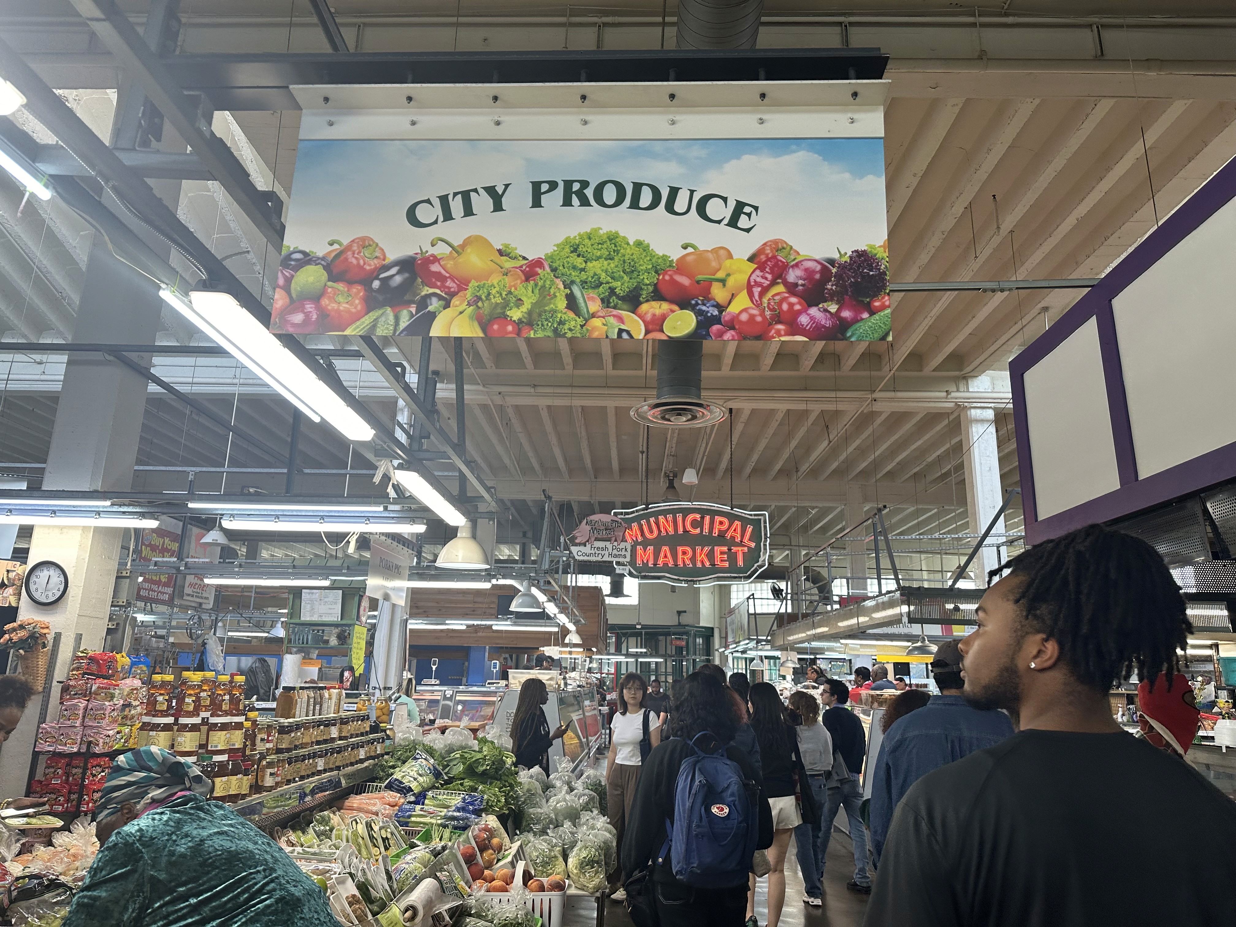
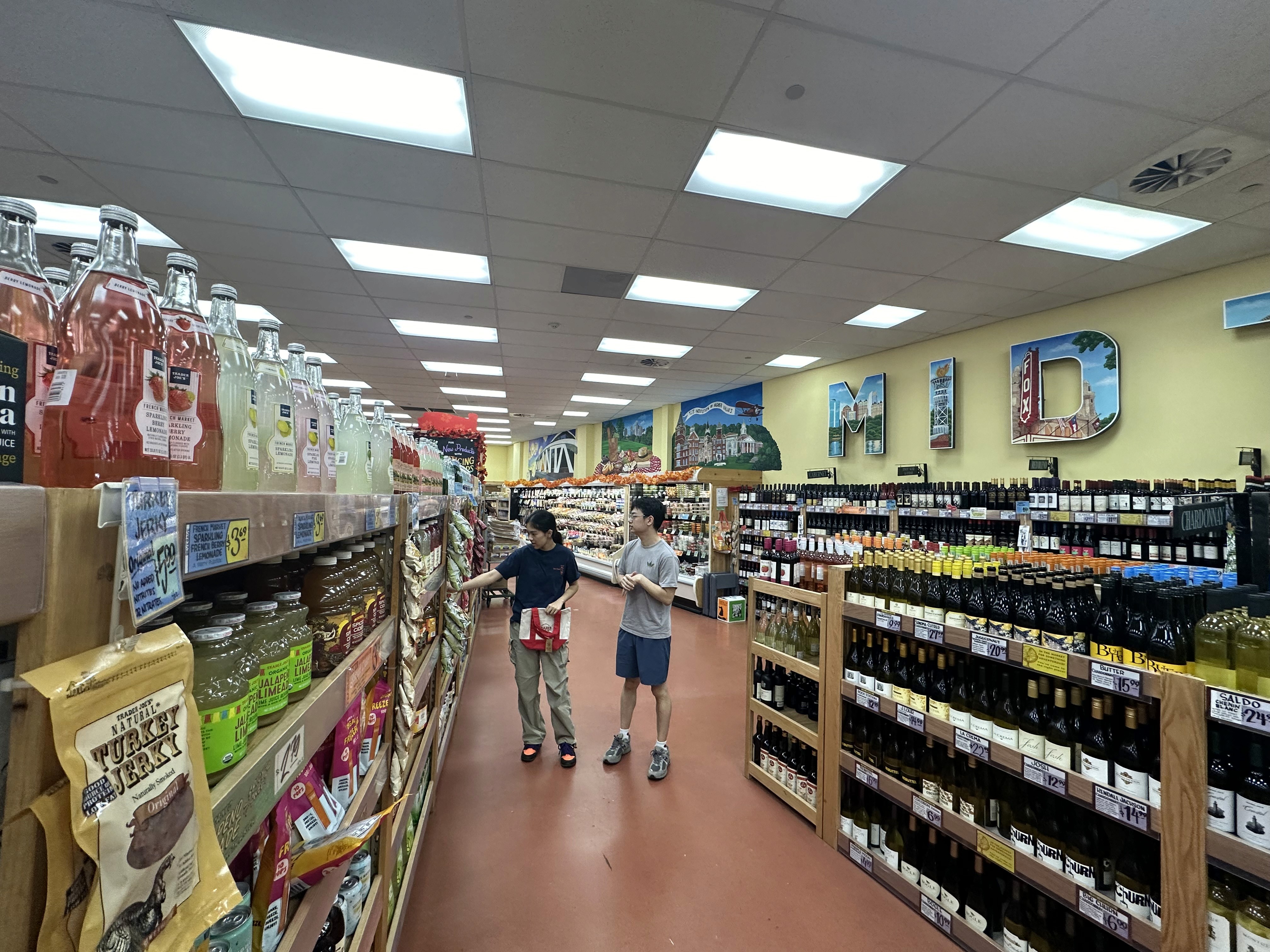
Site Audits
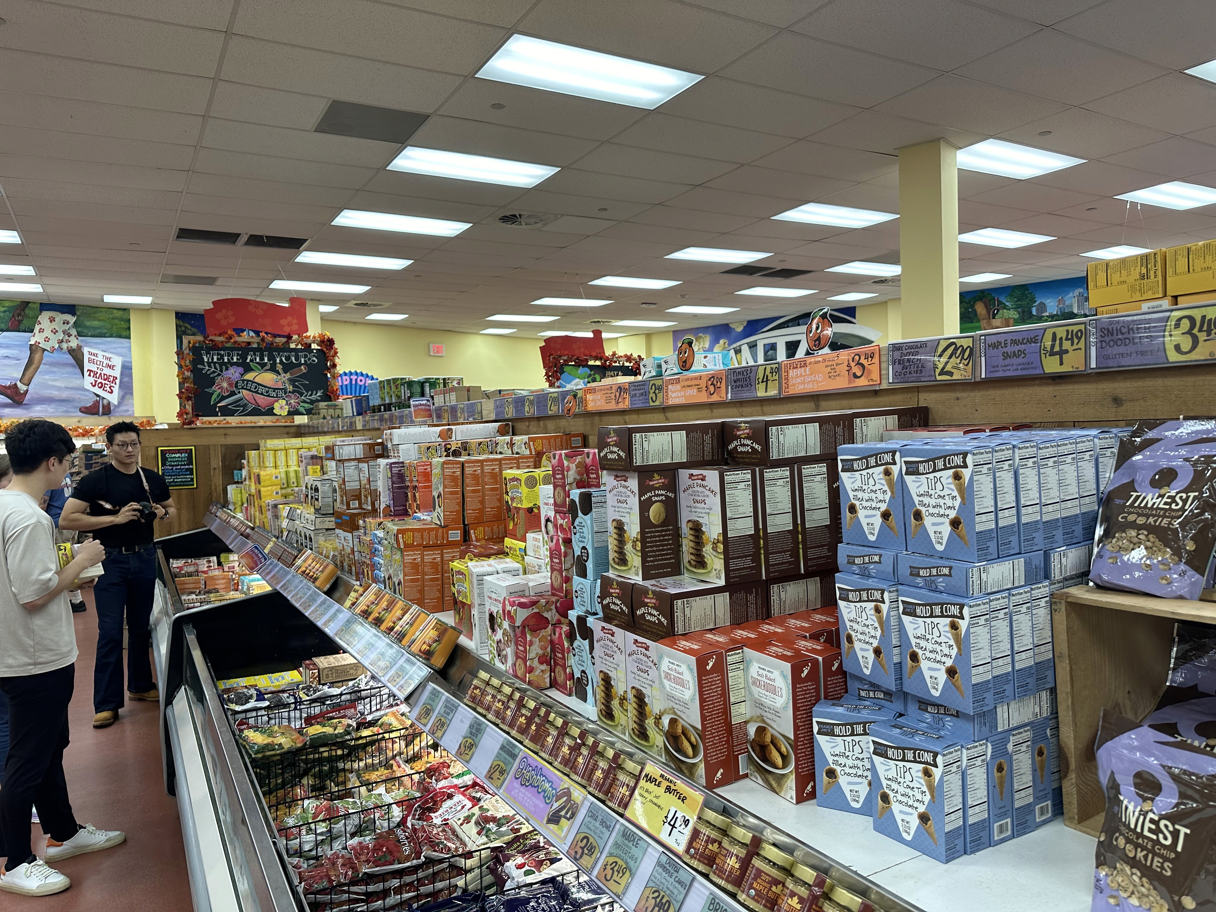
We began by visiting local supermarkets to observe navigation and product discovery in real contexts.
What We Observed: Narrow aisles caused the “butt-brush effect,” discouraging seniors and busy professionals alike. Younger shoppers skipped entire sections due to poor wayfinding.
Key Takeaway: Customers needed clearer paths and signage from the moment they entered.


Stakeholder Interviews
Discussions with city officials, local businesses, and community advocates underscored the need for a store concept that also tackled homelessness and nurtured local vendors.
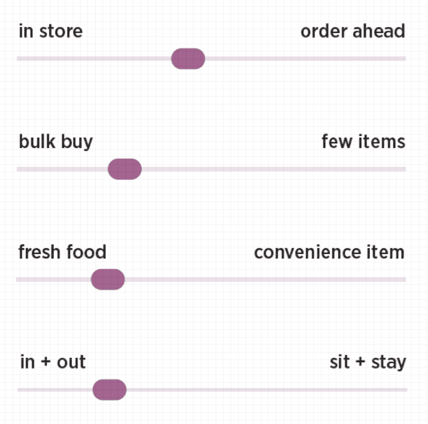
User Surveys & Personas
Target groups included, Industry experts, members of the community and GSU students
Natasha
Natasha is a GSU student, who is well-educated on her health, and values foods that leave her nourished and ready to take on the day. She prefers to make food at home for cost, and is open to exploring ready-made healthy meals around GSU campus.
Brands Frequented

"I try to cook at home as much as I can, but I occasionally get takeout if there are healthy options."
Shopping Habits
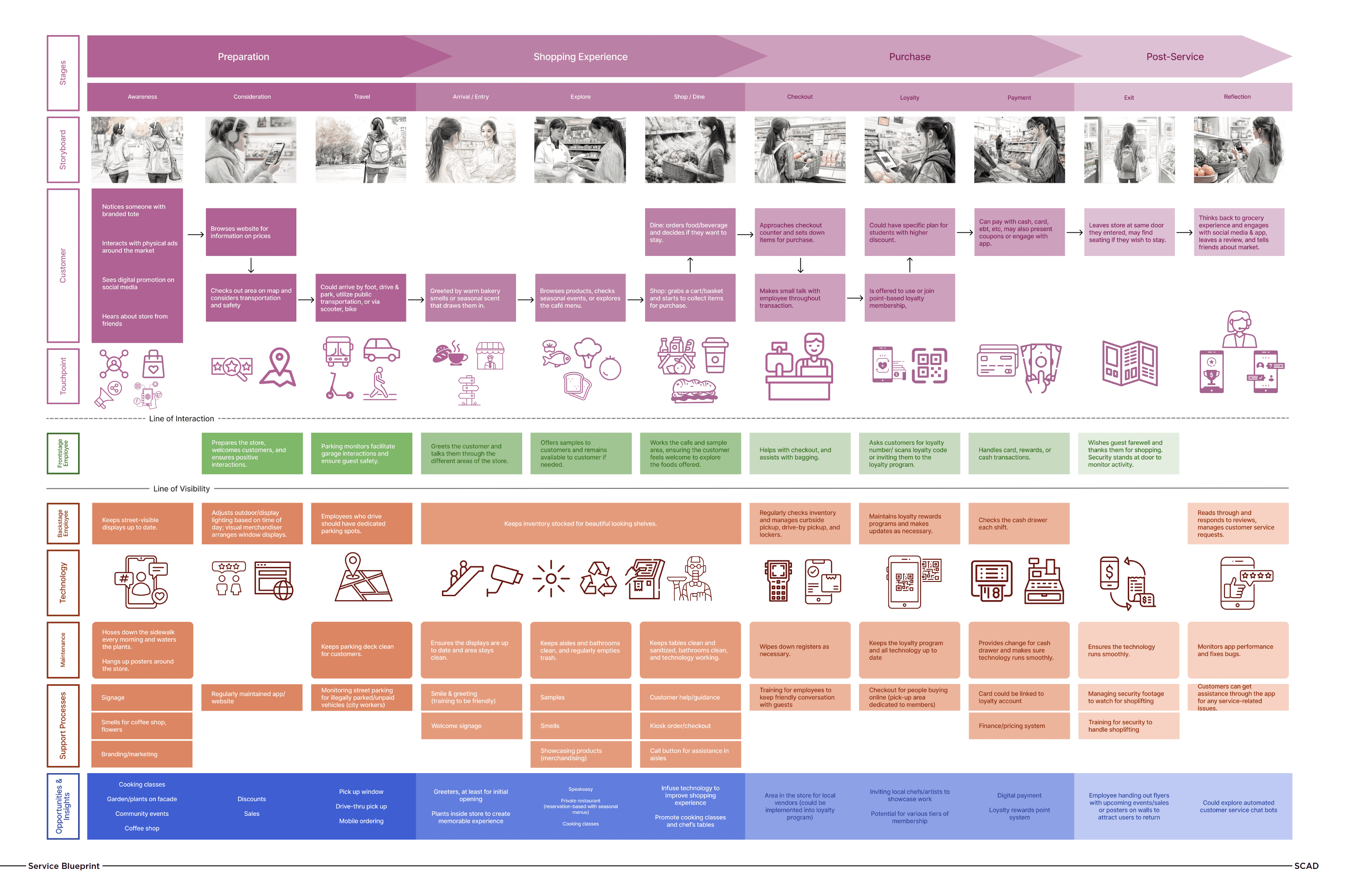
Service Blueprinting
Detailed user journeys (awareness to exit) revealed friction points like unclear pricing and crowded checkouts.
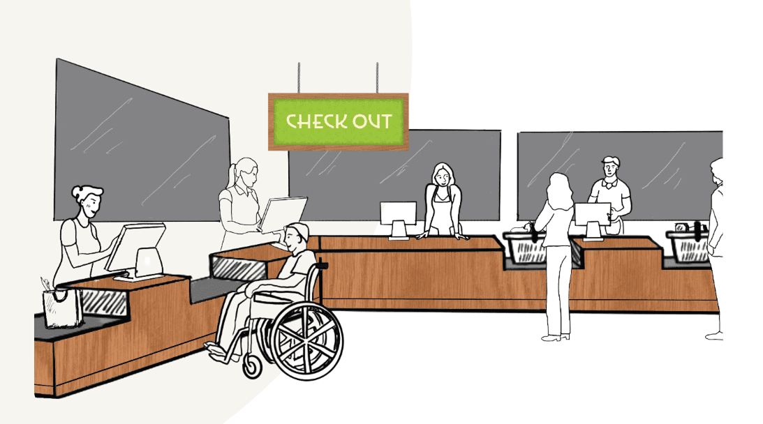
Accessibility Audits
Committed to an accessibility-first design inspired by user insights and city guidelines.
Gaps Identified: High shelves, low-contrast signage, and minimal maneuvering room.
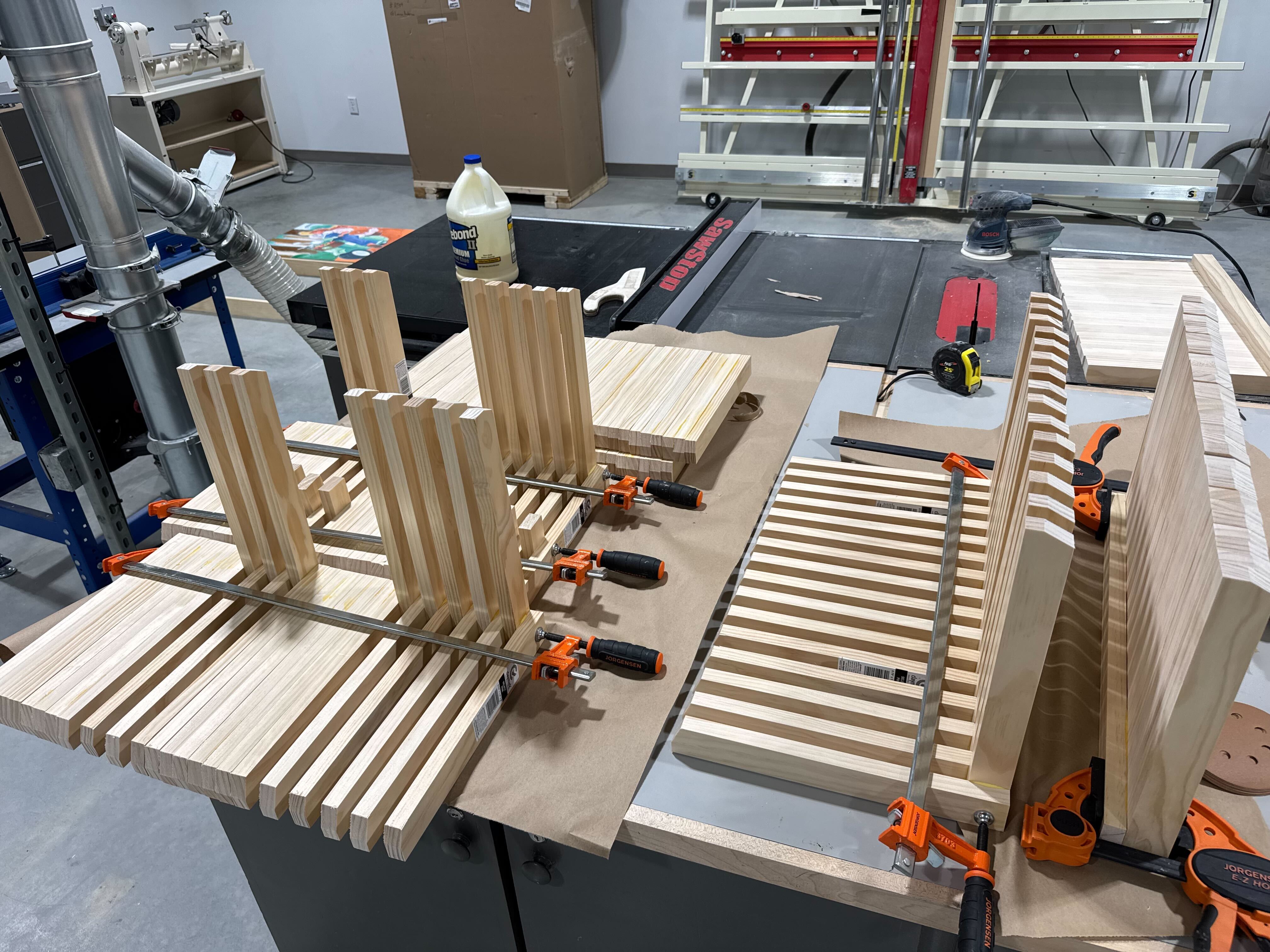
Ideation & Brand Development
A resounding triumph not only in success but in exceeding our 3D modeling goals with "Prismatic Dreams." This venture is a testament to our unwavering commitment, revealing unparalleled visual complexity within the mesmerizing world of spheres. Fluid transitions between elements and lifelike textures showcase not only our heightened technical prowess but also spark innovative approaches to abstract modeling. "Prismatic Dreams" is more than a project; it's a transformative odyssey reshaping the landscape of visual exploration.
Introducing a companion to this odyssey—a bespoke mobile application. This addition enhances the accessibility of "Prismatic Dreams," inviting users to explore enchantment at their fingertips. Seamlessly integrating spherical narratives, the app offers an immersive, user-friendly experience that extends the magic beyond traditional artistic expression.
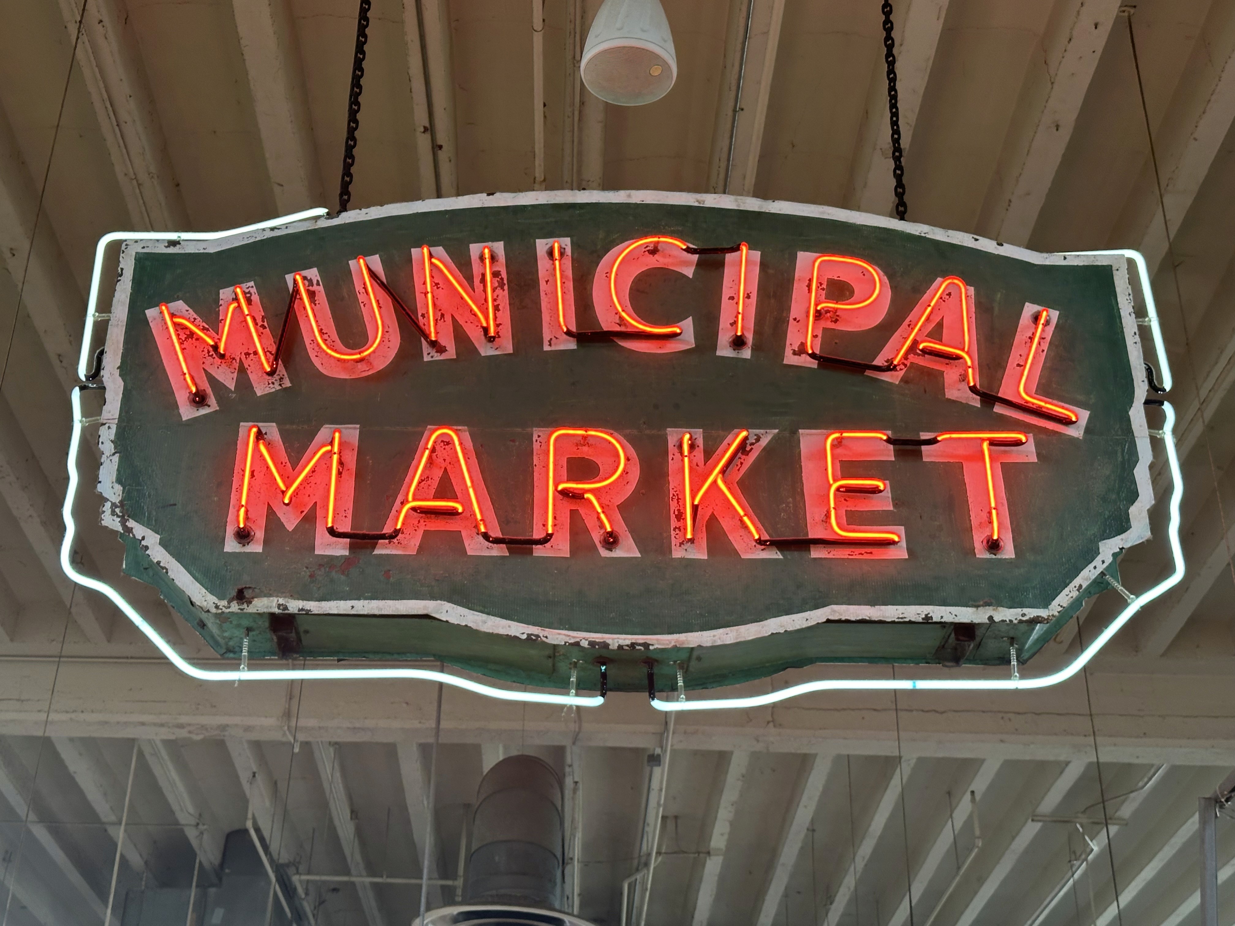
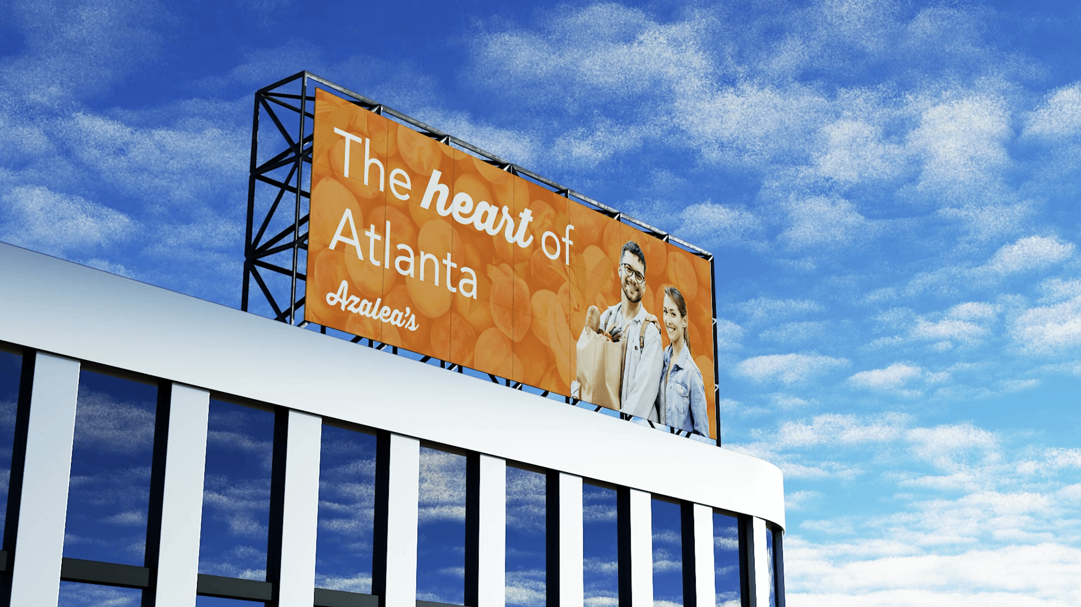
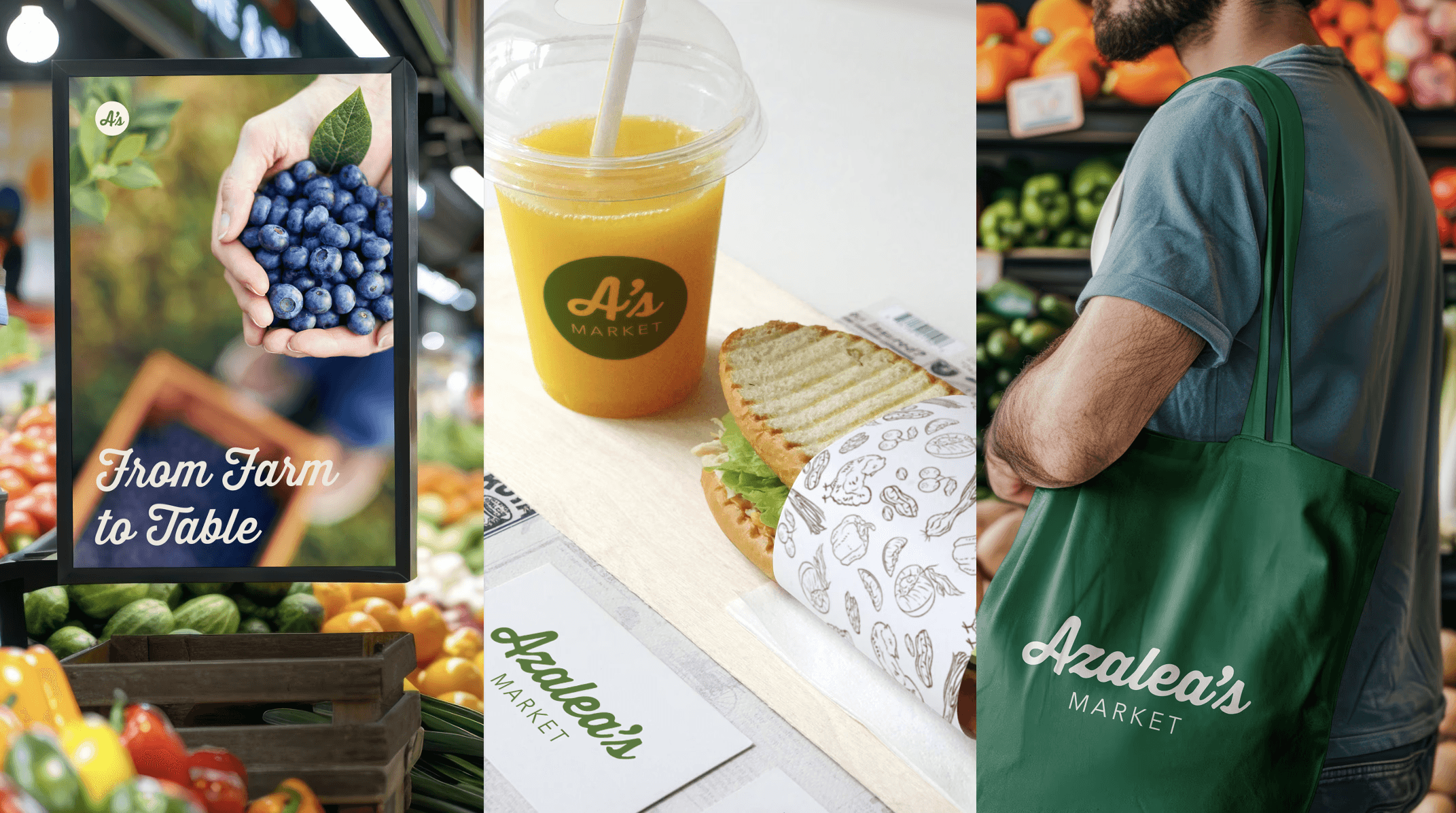
Stakeholder reviews and user feedback guided us to Azalea’s Market, reflecting Atlanta’s welcoming energy.
Design Solutions


Workforce Development & Local Sourcing

Modular Shelving & Local Product Spotlight
Designed flexible, height-adjustable shelving with clear visibility, walkable layouts, and dedicated zones for community-sourced produce.


Accessibility-First Store Layout
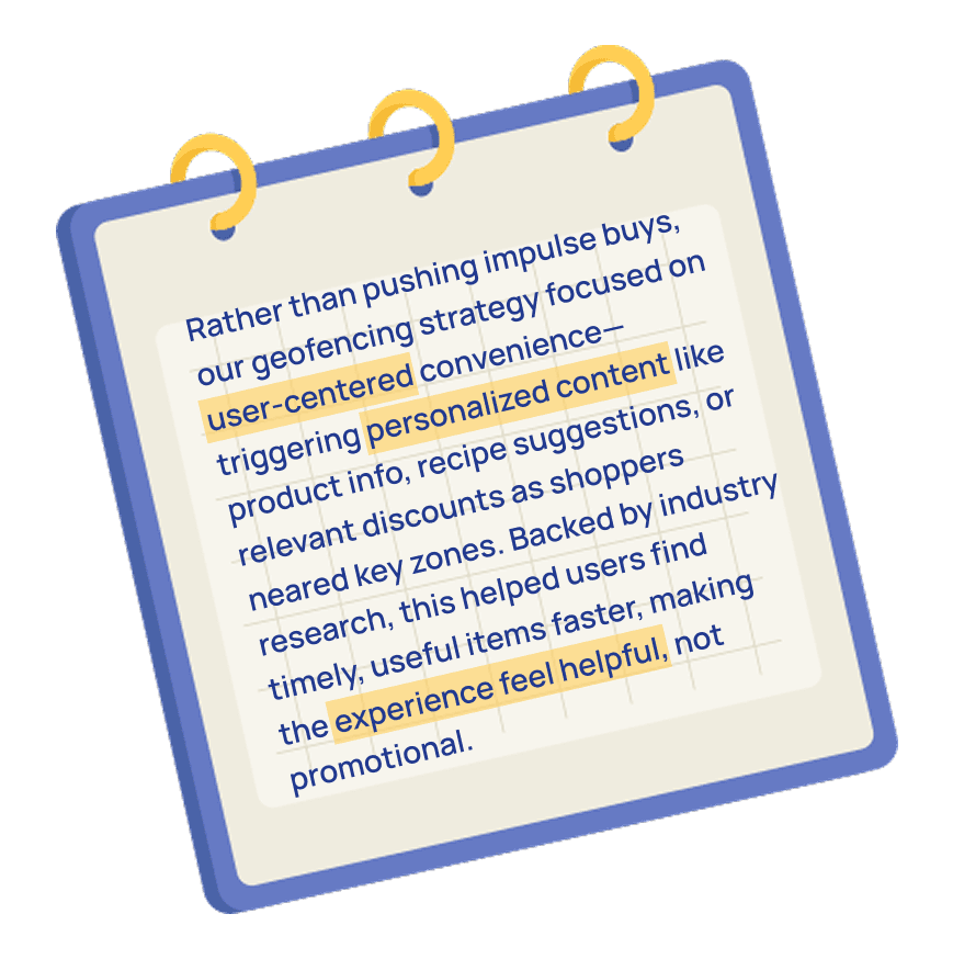
We proposed using high-contrast signage and having aisle widths of around 4–6 ft to accommodate carts without creating pinch points.
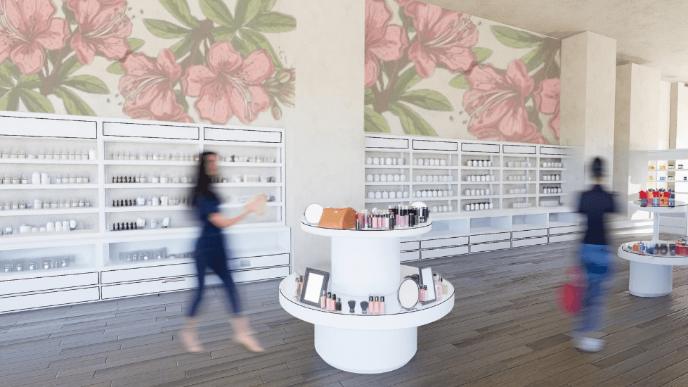

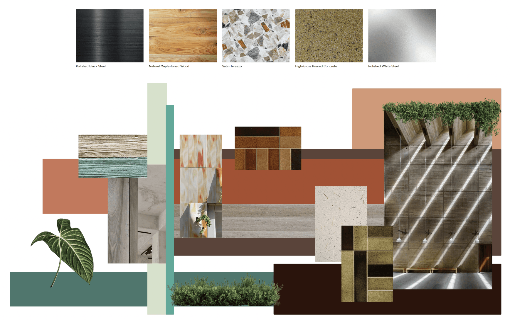
Color and Material Check
Muted tones near produce helped users linger, while vibrant accents in social zones drew curiosity. Signage was simplified after testers flagged visual clutter.
💡Warmer lights near bakery samples drew attention, while cool tones kept produce fresh-looking. A subtle citrus scent at the entrance made the space feel inviting.
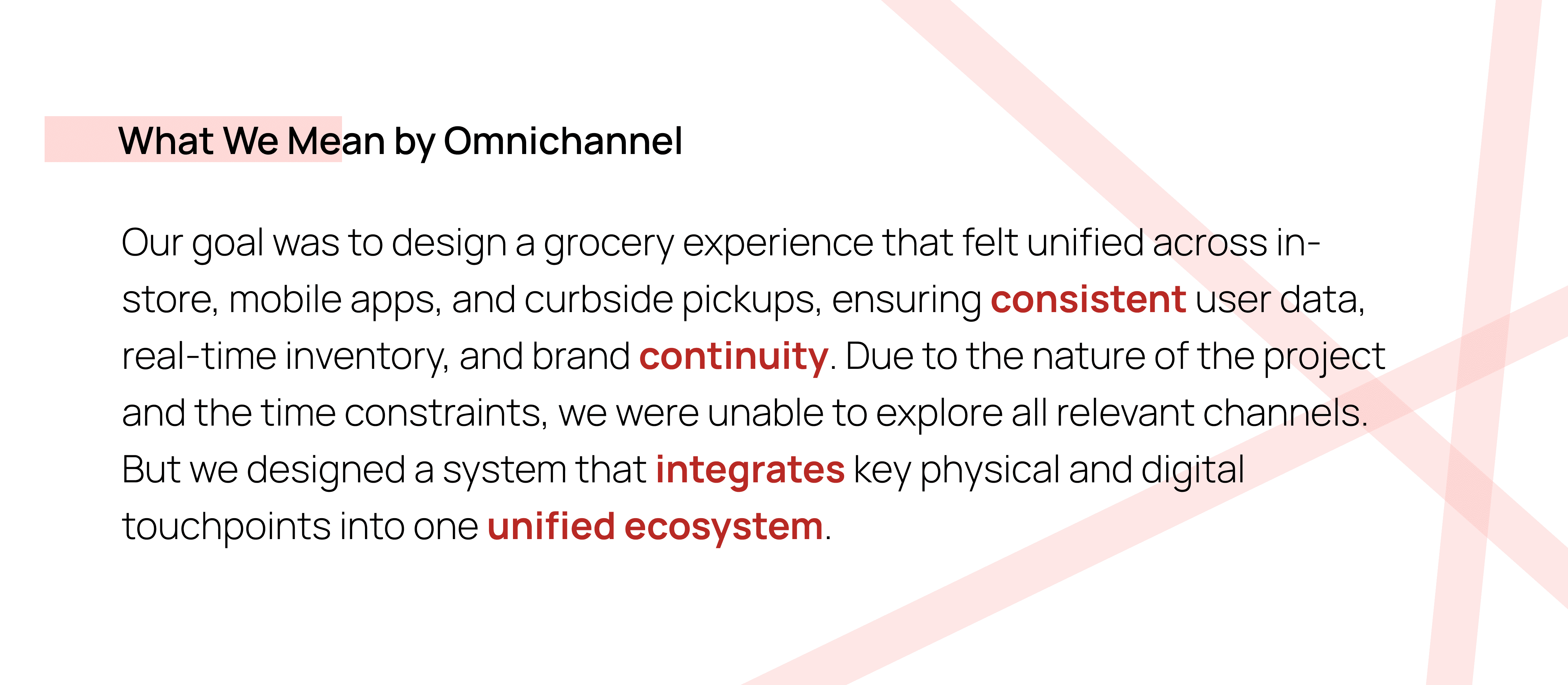
Omnichannel Experience & Validation


Real-World Outcomes