CLIENT
ROLE
YEAR
LOCATION
Overview

Problem

Research
01
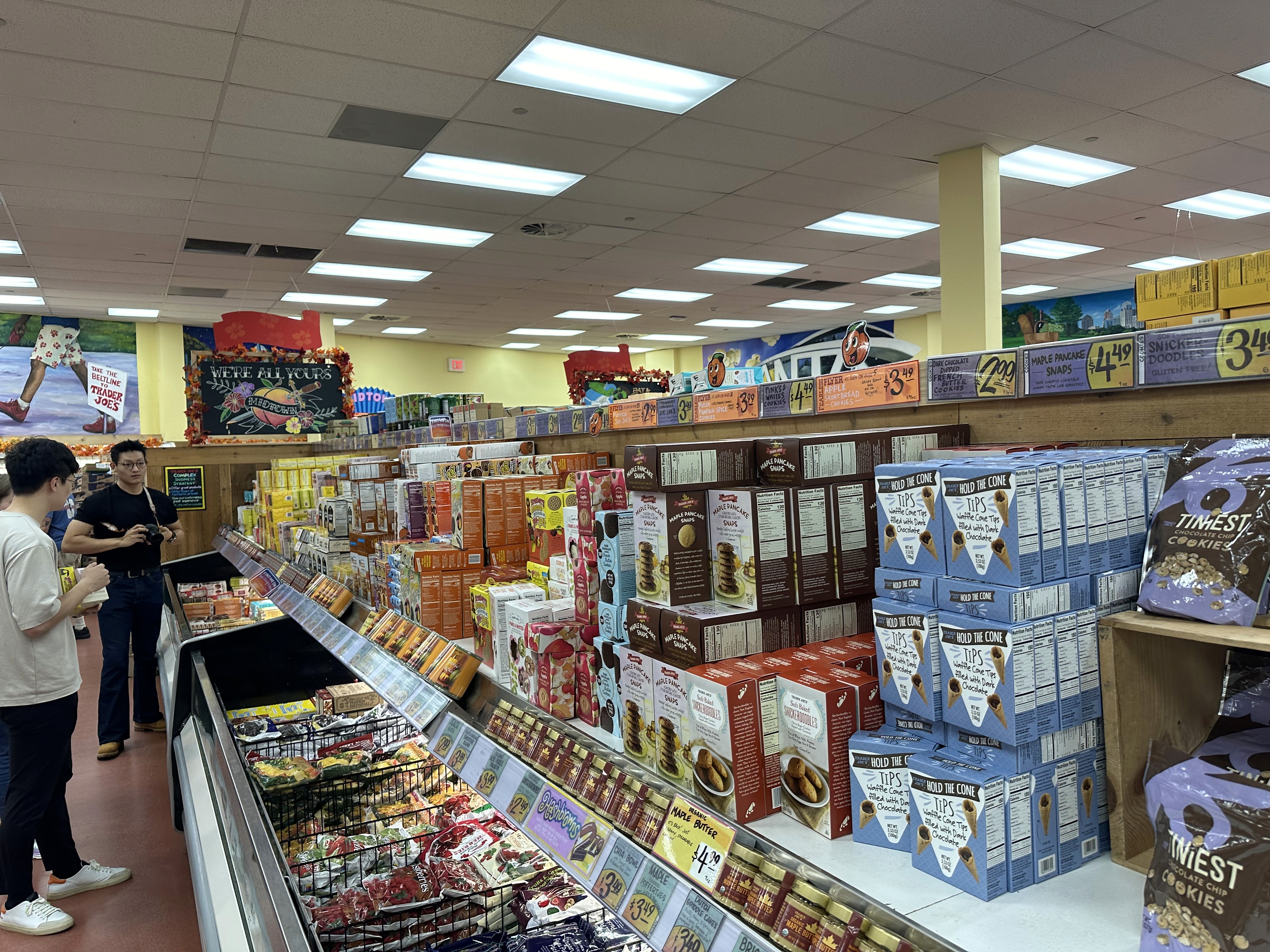
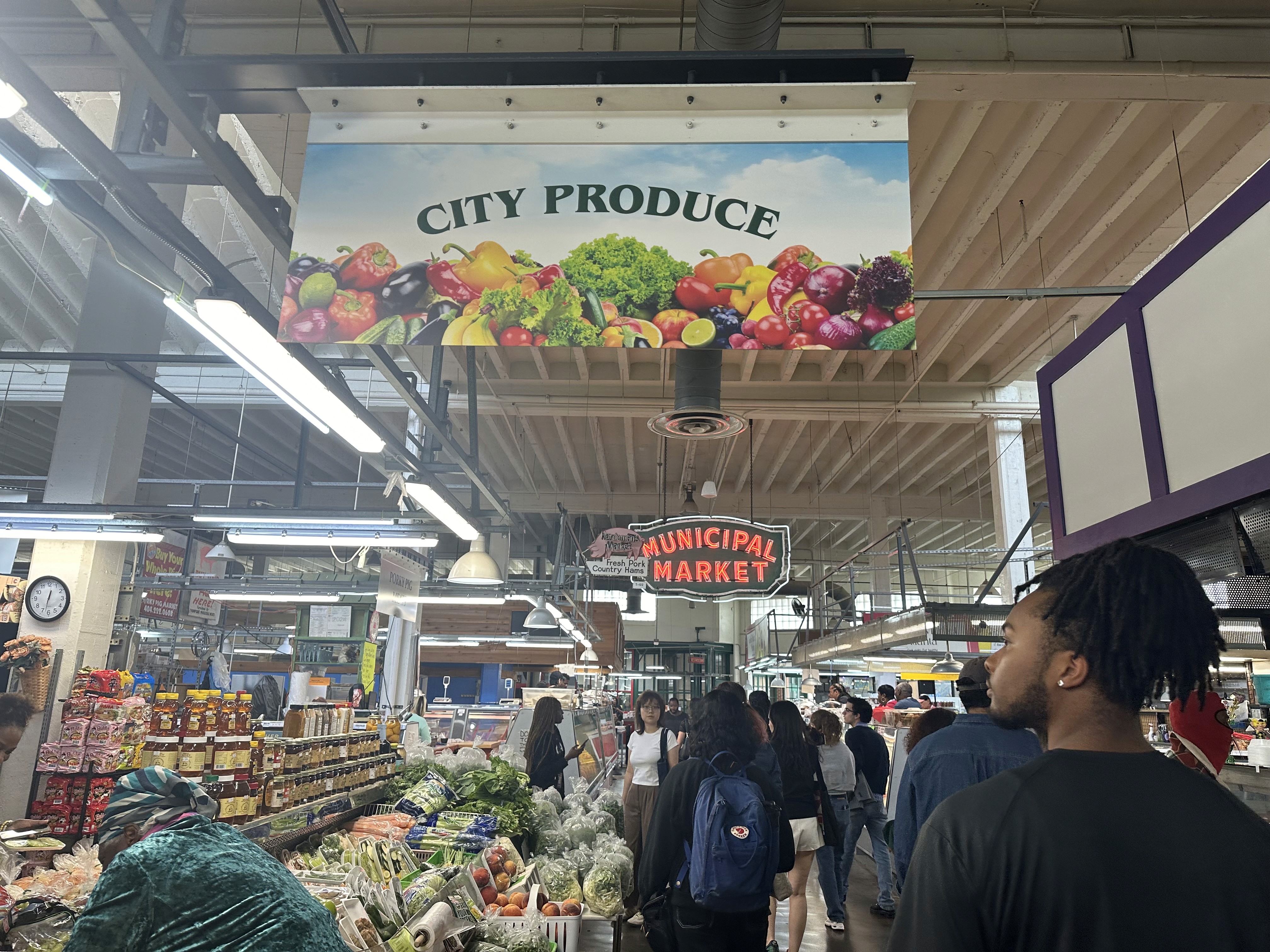
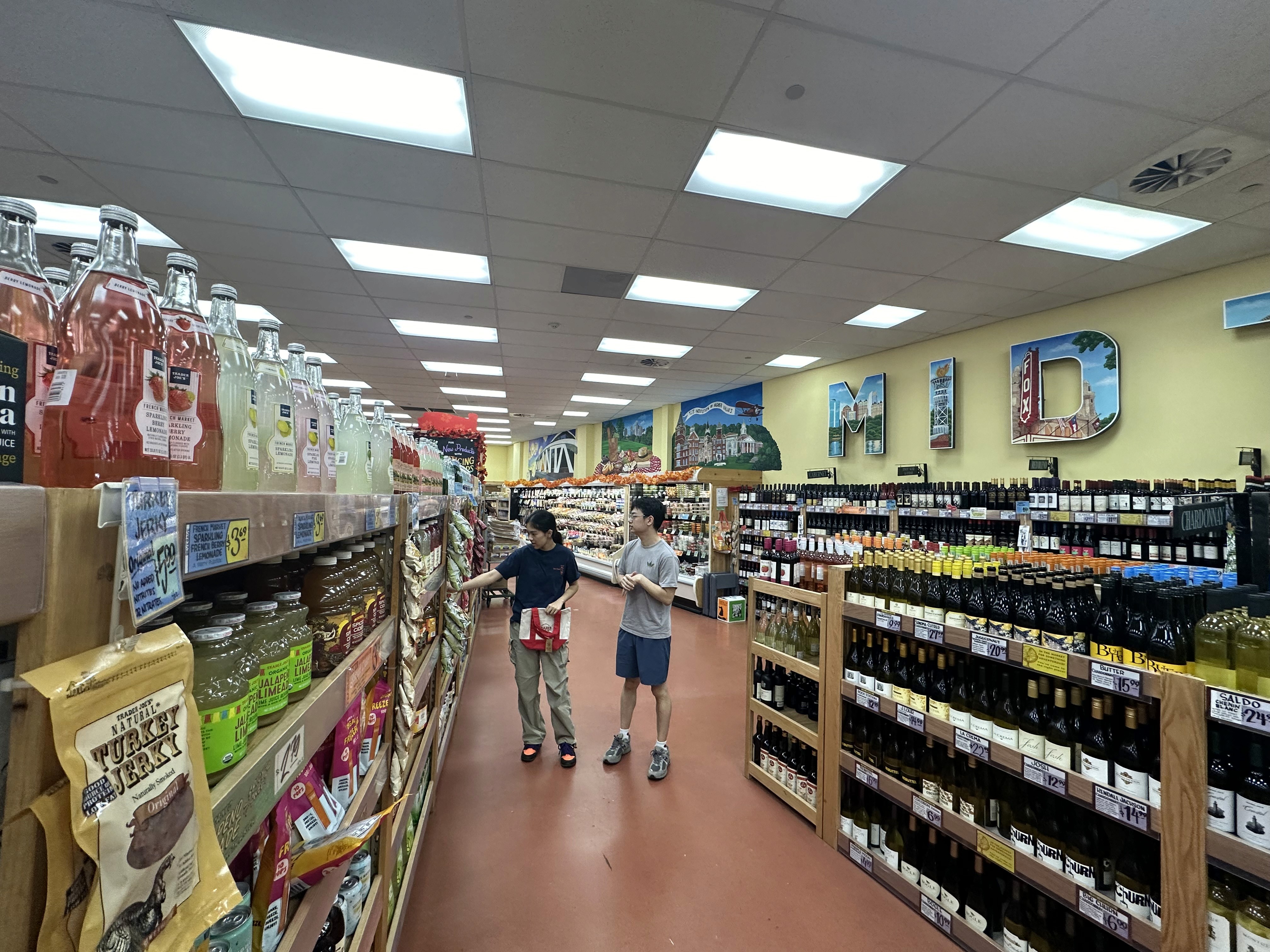
Site Audits
We began by visiting local supermarkets to observe navigation and product discovery in real contexts.
What We Observed: Narrow aisles caused the “butt-brush effect,” discouraging seniors and busy professionals alike. Younger shoppers skipped entire sections due to poor wayfinding.
Key Takeaway: Customers needed clearer paths and signage from the moment they entered.
Key Takeaway: Customers needed clearer paths and signage from the moment they entered.


02
Stakeholder Interviews
Discussions with city officials, local businesses, and community advocates underscored the need for a store concept that also tackled homelessness and nurtured local vendors.
03
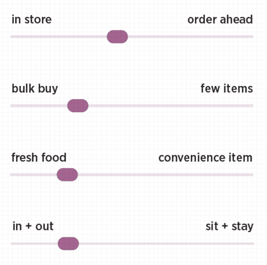
User Surveys & Personas
Target groups included, Industry experts, members of the community and GSU students
Natasha
Natasha is a GSU student, who is well-educated on her health, and values foods that leave her nourished and ready to take on the day. She prefers to make food at home for cost, and is open to exploring ready-made healthy meals around GSU campus.
Brands Frequented

"I try to cook at home as much as I can, but I occasionally get takeout if there are healthy options."
Shopping Habits
04
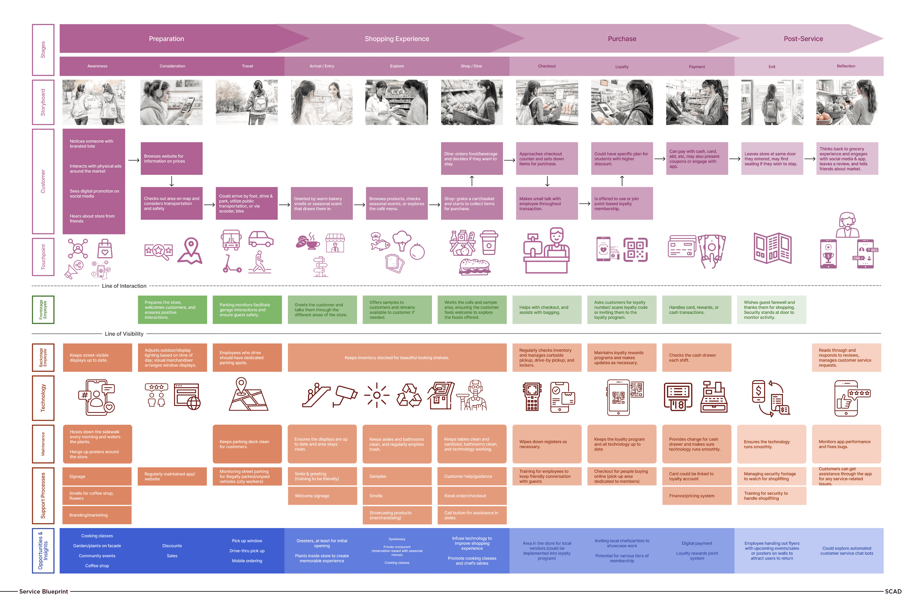
Service Blueprinting
Detailed user journeys (awareness to exit) revealed friction points like unclear pricing and crowded checkouts.
05
Accessibility Audits
Committed to an accessibility-first design inspired by user insights and city guidelines.
Gaps Identified: High shelves, low-contrast signage, and minimal maneuvering room.
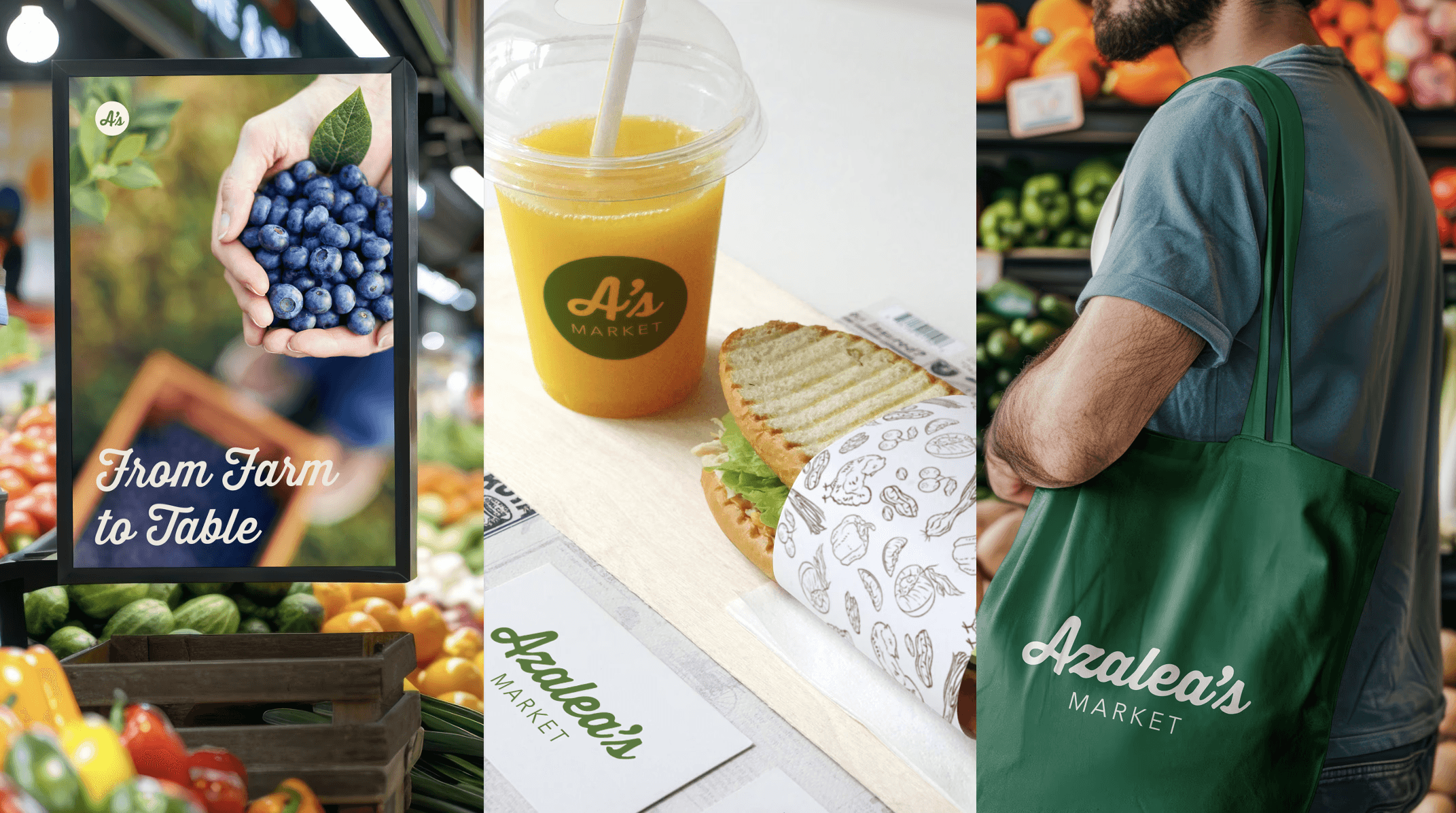
Ideation & Brand Development
Stakeholder reviews and user feedback guided us to Azalea’s Market, reflecting Atlanta’s welcoming energy.
Design Solutions

01
Smarter Flow & Cart Design
We designed store concepts with wider aisles and direct routes to popular zones (like produce and grab-and-go). We also introduced a two-tiered, compact carts concept with hooks for reusable bags—perfect for frequent, smaller trips in a dense urban area.


02
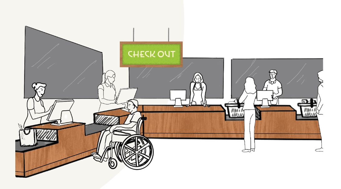
Mobile Experience & Checkout Efficiency
To support on-the-go users and extend the in-store experience, we proposed a mobile platform that allowed customers to:
Order ahead for pickup or locker retrieval, minimizing time spent in-store
Scan product QR codes for sourcing details, nutrition facts, and recipe suggestions
Use scan-and-go checkout to scan items as they shop, track totals in real-time, and pay directly through their device—bypassing traditional checkout lines entirely
Access loyalty rewards and weekly promotions tailored to their purchase history
Engage with culinary programs, including in-store events and training sessions
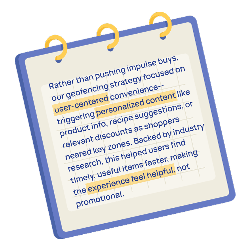
A Note On Promotional Geofencing
03
Workforce Development & Local Sourcing

04
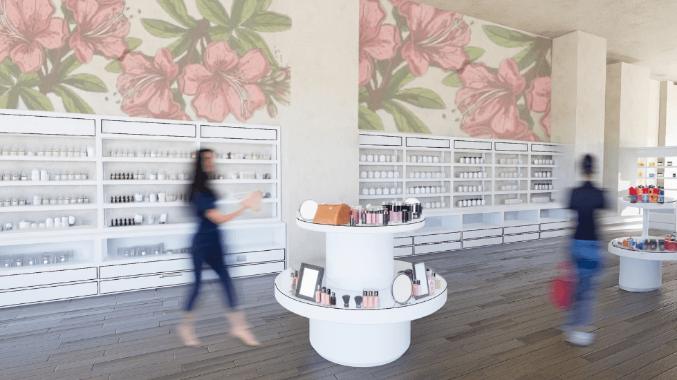
Modular Shelving & Local Product Spotlight
Designed flexible, height-adjustable shelving with clear visibility, walkable layouts, and dedicated zones for community-sourced produce.


05
Accessibility-First Store Layout
We proposed using high-contrast signage and having aisle widths of around 4–6 ft to accommodate carts without creating pinch points.

06
Color and Material Check
Muted tones near produce helped users linger, while vibrant accents in social zones drew curiosity. Signage was simplified after testers flagged visual clutter.
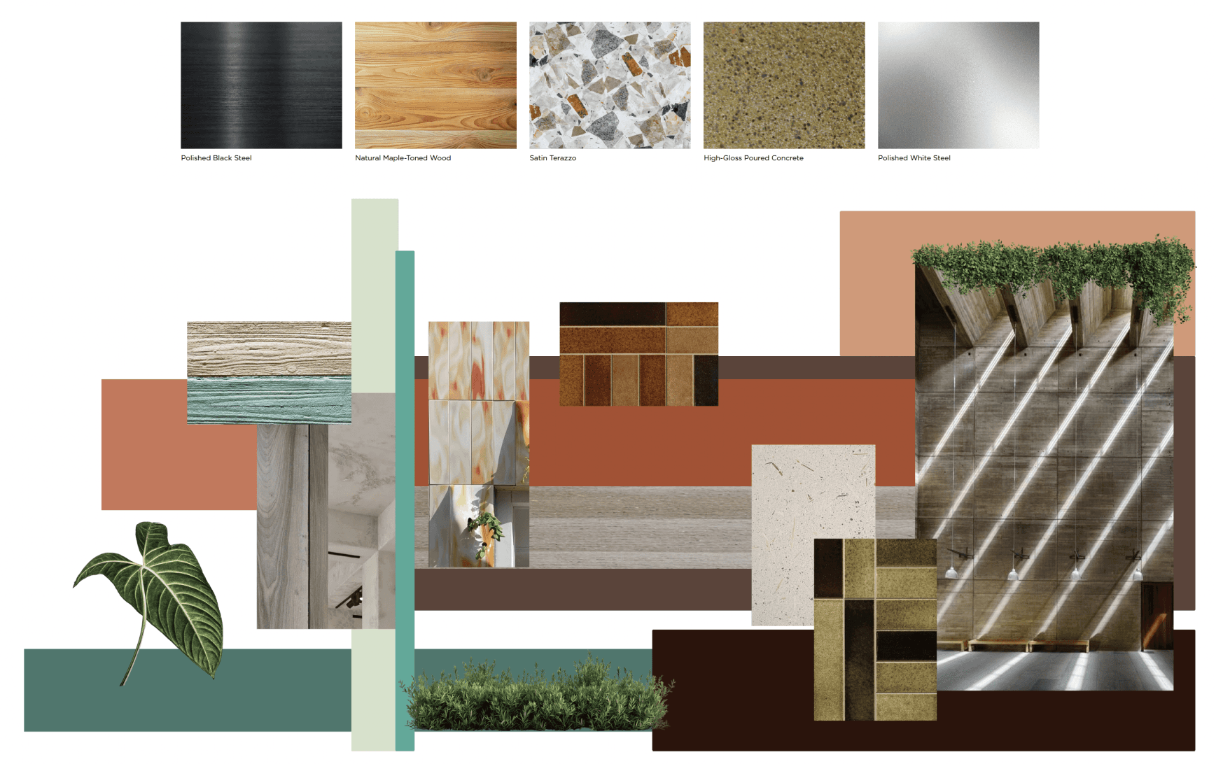
💡Warmer lights near bakery samples drew attention, while cool tones kept produce fresh-looking. A subtle citrus scent at the entrance made the space feel inviting.
Omnichannel Experience & Validation
Key Validation Insights:

01 Scan-and-Go
Students who have had experiences with similar technologies noted that it helped them shave off considerable waiting time.
02 Digital Signage
Students who have had experiences with similar technologies noted that it helped them shave off considerable waiting time.

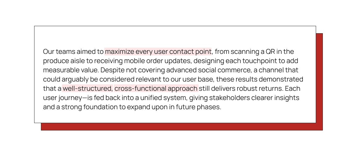
Importance of Cross-Functional Collaboration
This omnichannel approach required close coordination among:
UX/CX Team: Consolidated user insights and ensured data/feature parity across channels


Branding & Advertising: Created a cohesive identity so customers recognized the store’s voice everywhere


Interior Design & Industrial Design Teams: Created digital and physical mockups of layout, aisles, shelving, and signage to match digital flows.


Real-World Outcomes
Presenting the Azalea’s Market concept to the Mayor and Savi’s founder won immediate support. The former Olympia Building is now under renovation, validating our omnichannel, customer and user centric approach—uniting user-centered design, brand storytelling, local partnerships, and robust technology—for a transformative grocery experience.